When Furniture Meets This Year's Trending Colors, Which Do You Pick?
As everyone knows, Pantone releases seasonal color trend reports every year, and as soon as the latest palette is unveiled, those shades start showing up in products across every industry. Today, we're sharing a set of office furniture pieces dressed in Pantone's Autumn/Winter 2021 trending colors — a little aesthetic delight from office furniture to enjoy in winter.
01.
Green Bee
PANTONE 17-6154
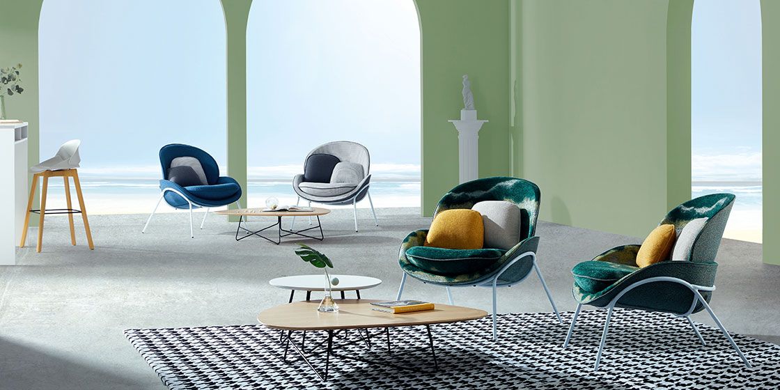
Pantone describes Green Bee as "a grass green that makes nature immortal." Applied to office furniture, it easily delivers a space brimming with vitality. When fitting out the office, pair grass-green furniture with unsaturated walls and other wooden pieces — the overall look feels fresh and comfortable without causing visual fatigue.
02.
First Blush
PANTONE 13-2003
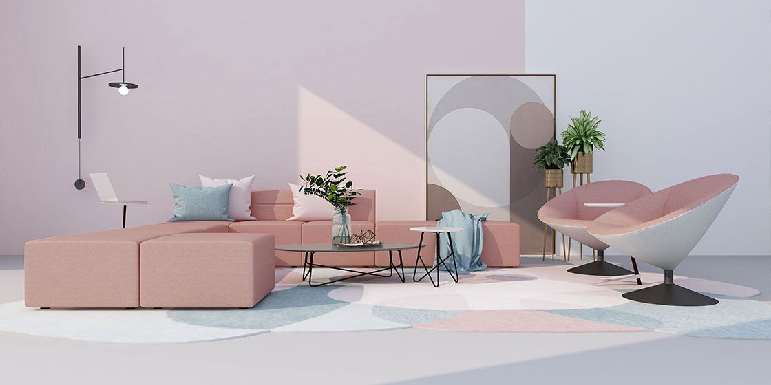
First Blush gives off a soft, gentle beauty, which is why it's often seen in family parks and photo studios. What happens when this dreamy shade meets office furniture? Yihang's Star Joy sofa uses biomimetic design, and in First Blush the space instantly turns warmer and softer. And a set like this can even go straight home with you as residential furniture.
03.
Tomato Cream
PANTONE 16-1348
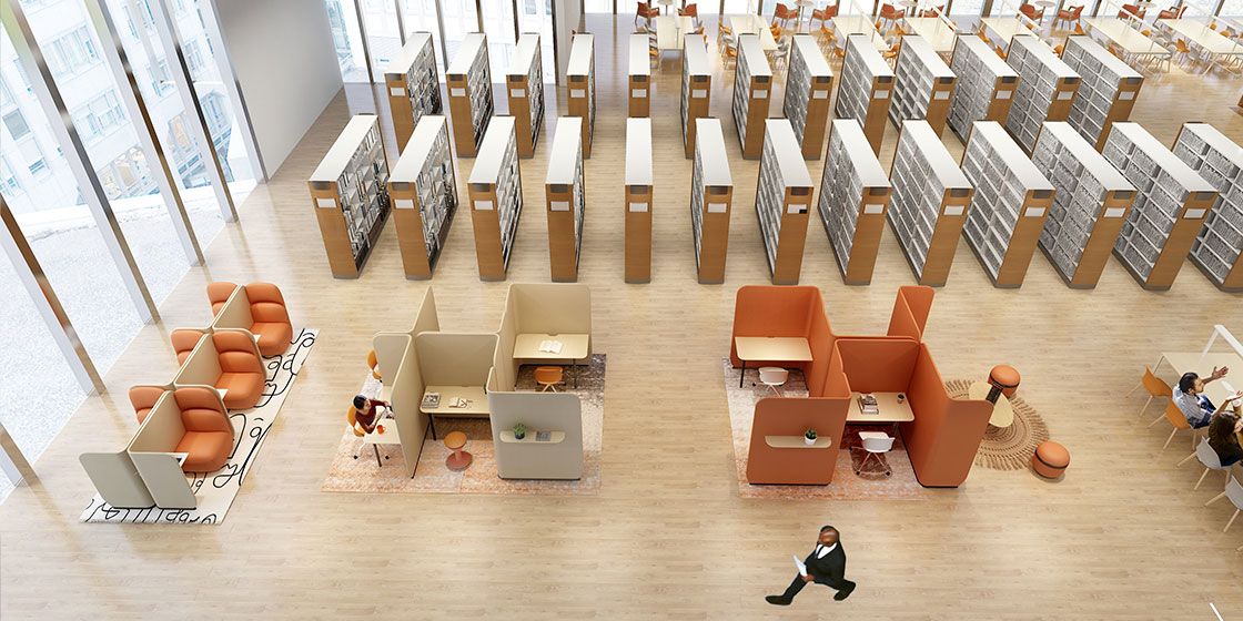
This is a warm, food-inspired color scheme — understated yet eye-catching in autumn and winter. As a furniture color, Tomato Cream reads lightly luxurious without losing its coziness. Furniture in this shade energizes the office, and its warmth gives working professionals a more comfortable experience.
04.
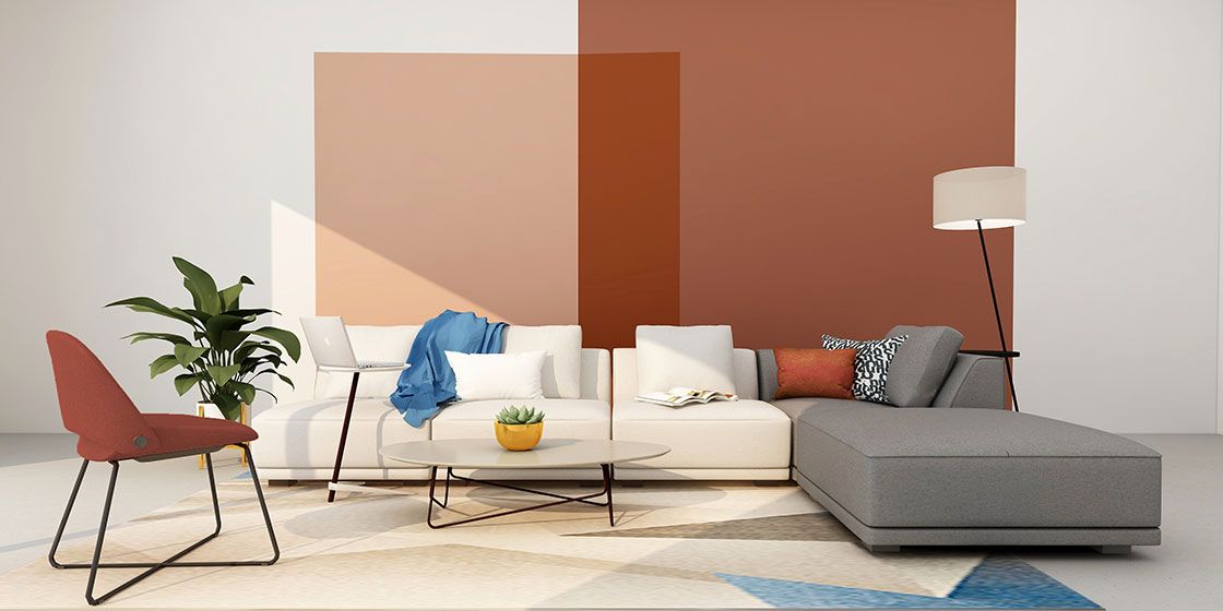
Downtown Brown
PANTONE 19-1223
Compared with Tomato Cream, Downtown Brown is a color drawn straight from the earth, so furniture in this hue lends an office space a naturally steady, dignified feel. Downtown Brown furniture is mostly found in relatively large spaces — reception areas, reading rooms, and the like — and this color scheme is also practical, hiding dirt well.
05.
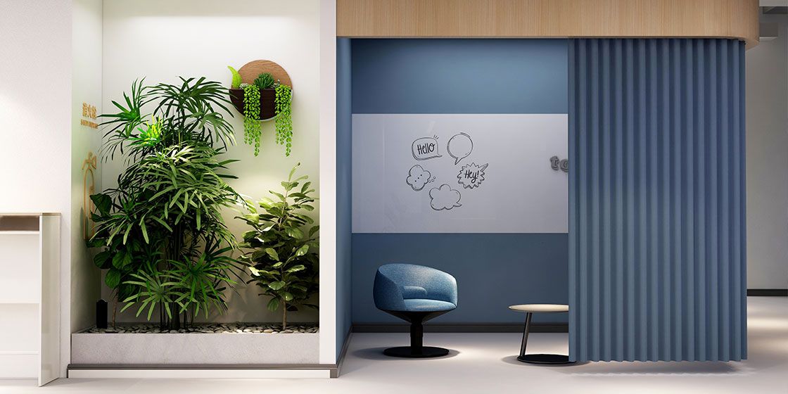
Ibiza Blue
PANTONE 17-4245
Ibiza Blue evokes the blue of island waters; with its deep, mysterious feel, you'll spot it in many furniture showrooms. Tech companies also often use furniture in this color to convey a reserved, composed brand character — and to help fast-paced employees soothe their anxiety through color.
06.
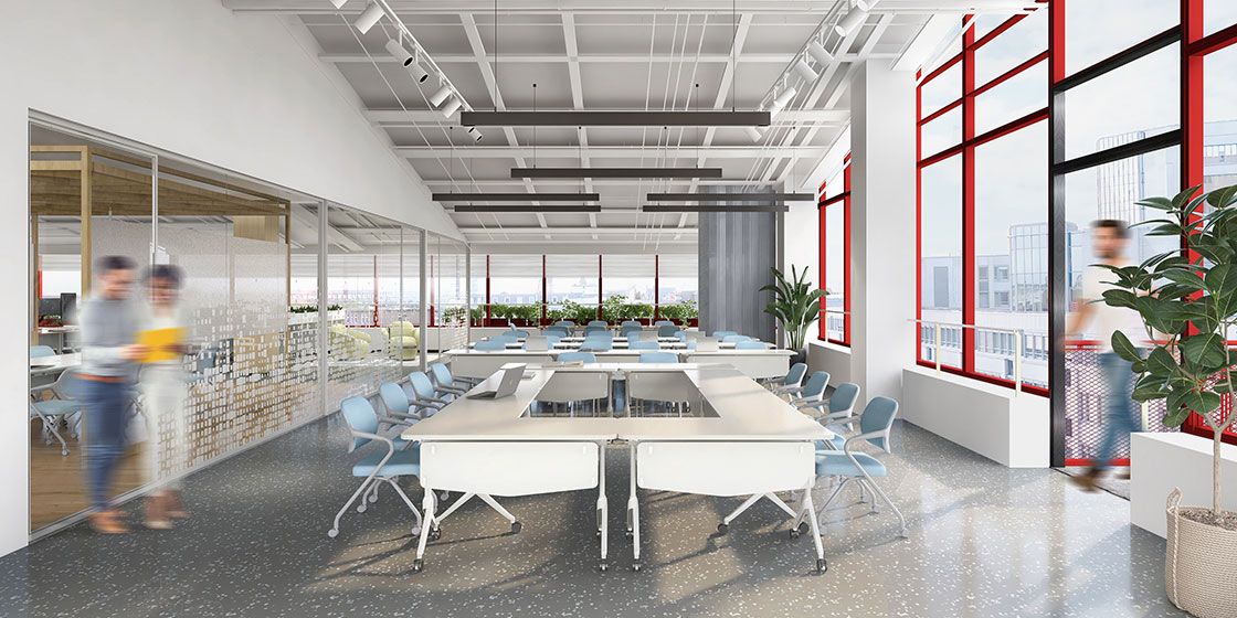
Clear Sky
PANTONE 14-4123
By contrast, this light blue is fresher and gentler, instantly calling to mind a clear blue sky. As office furniture takes on home-like design, pieces in this healing blue are increasingly common — especially in companies' hybrid workspaces, where it pairs effortlessly with furniture in other color families.
07.
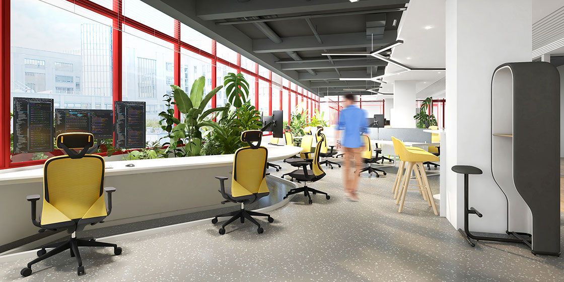
Illuminating
PANTONE 13-0647
Illuminating yellow is all about energy in the public imagination. That's why Illuminating furniture tends to appear in larger offices, where it fills the space without being overwhelming. At the same time, energetic furniture counterbalances the stiff, serious air of a typical office, making the whole space feel trendier and more comfortable.
08.
Winery
PANTONE 19-1537
An elegant, refined red carries a built-in sense of luxury, making it one of the most common colors in furniture design. Softer than true red, Winery works both as an accent and in large swaths, radiating the warmth of home. For now, Winery furniture appears mostly in lounge areas, giving people that warm, homely feeling.

In short: as office spaces become ever more varied, furniture customization is turning personal and distinctive — and creative color schemes are a step you can't afford to overlook. How do you find the right palette? Companies can reference trend colors from authoritative institutes like Pantone, or entrust a professional furniture supplier with customization. Yihang, for example, offers one-stop, whole-space solutions and tailors the highest-quality plan for your company from every dimension.
You may also like

European Designer Interview: Uncovering the Fun of Office Furniture
Read More
Freedom Without Excess: Where Creative Teams Should Work
Read More
Inclusive Office Design: Optimizing Furniture for Happiness
Read More