Three Color-Matching Techniques Your Office Design Shouldn't Miss!
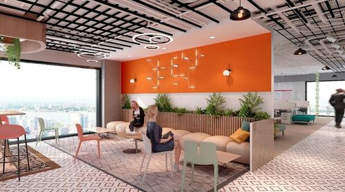
Many offices look as if they were cut from the same mold, differing only in layout. That's why color design should be planned around each distinct functional zone, with the overall color composition of the space fully taken into account. To keep the office decor consistent while still highlighting each area's character, consider the following three aspects:
1. Room Size
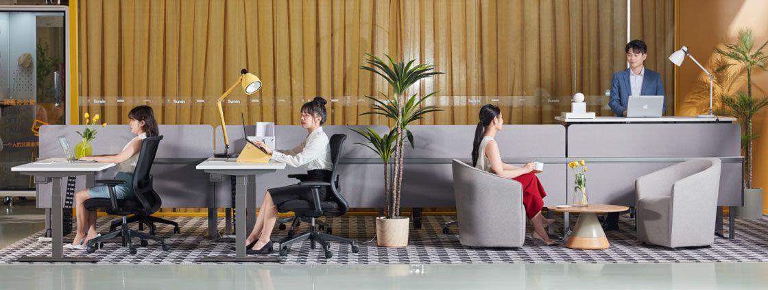
In contemporary office design, how should room size and color be balanced? Light gray can feel tense, but it makes an office look more spacious. Light blue and pale green are both excellent choices for wall paint. In terms of the psychology of color, yellows tend to evoke positive emotions, which makes them well suited to work settings.
2. Natural Light
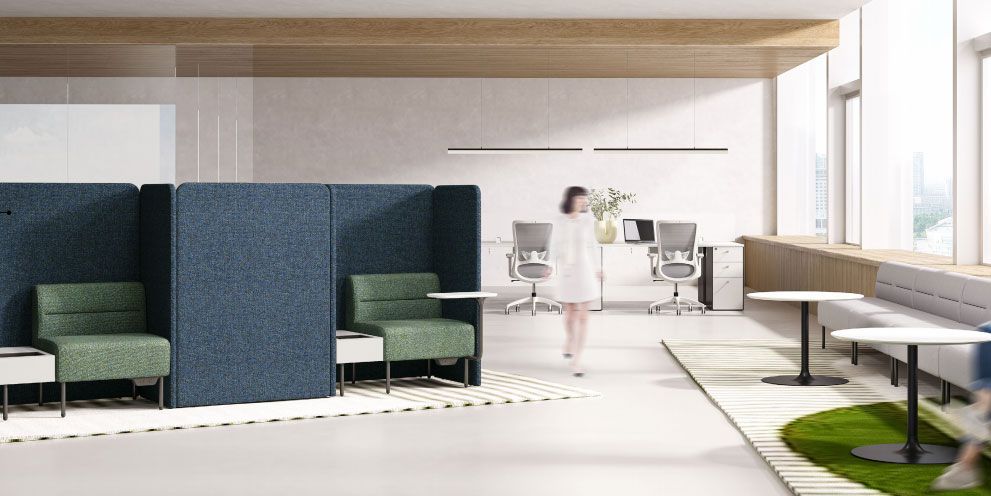
Offices flooded with sunlight lift the mood, while offices that face away from the sun — or have no windows at all — feel cold and unwelcoming, and poor ventilation and lighting are bad for health.
For this reason, warm color schemes make an office feel warm and inviting. Avoid strongly reflective colors on the walls; otherwise the glare will cause eye strain and fatigue, quietly dragging down work efficiency.
3. Type of Work
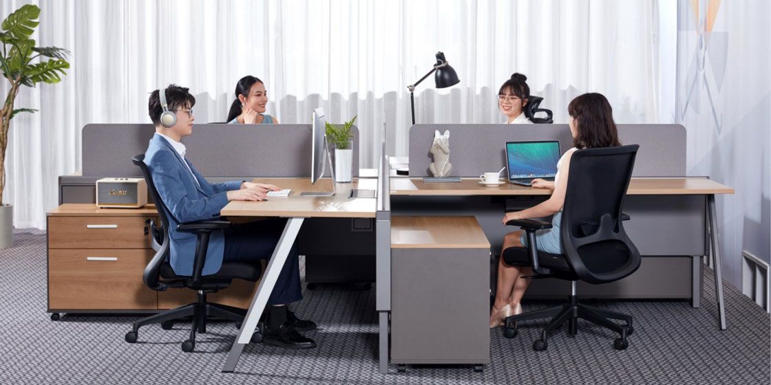
What employees actually do is another essential factor in choosing a color scheme. The right colors can multiply productivity.
For example, research organizations benefit from calm, subdued colors that support deep, focused thinking. Offices that involve frequent communication and social interaction — such as a planning department — can use bright, vivid, energetic colors as accents to spark imagination at work.
To create an office space that satisfies both you and your clients, learn to think from different perspectives. Consider these three points carefully, and you'll build a healthy, high-efficiency workplace.