Office Chair Promotional Brochure
The design of office chair promotional brochures can draw inspiration from a variety of styles and elements, combining modern aesthetics with functional displays to highlight product features and attract target customers.

I. Style Selection
Modern Minimalist Style
Utilize dark brown, gray, or blue as primary colors, paired with clean lines and geometric shapes to create a professional and stylish visual effect. For example, a dark brown modern, fashionable, and minimalist-style furniture company promotional tri-fold brochure conveys a sense of stability through low-saturation colors, suitable for corporate procurement scenarios. Gray or blue minimalist and elegant designs exude a more technological feel, ideal for promoting innovative office spaces.Antique or Classical Style
Refer to materials such as classical furniture brochures and Ming and Qing dynasty furniture catalogs, incorporating traditional elements like wooden textures, mortise-and-tenon joint patterns, or ink wash backgrounds, suitable for brands focusing on high-end solid wood office chairs. Such designs should balance tradition and modernity, avoiding excessive complexity, and can reflect cultural heritage through local embellishments (such as close-up shots of carved chair backs).Business Minimalist Style
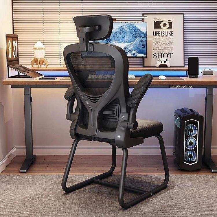
Focus on black, white, or metallic colors, emphasizing functionality and practicality. For instance, a black business minimalist office desk and chair e-commerce detail page highlights ergonomic design and adjustable features as selling points through simple layouts and high-definition product images, suitable for online sales or exhibition distribution.
II. Content Layout
Cover Design
Use a 45-degree angle high-definition image of an office chair as the main visual, paired with the brand logo and a core slogan (such as "Comfortable Office Work Starts with a Good Chair"). The background can feature gradient colors or abstract patterns to avoid overpowering the main visual.Inner Page Content
- Product Features: List core advantages in bullet points, such as "breathable mesh fabric", "four-level adjustable lumbar support", and "360° rotating silent wheels", accompanied by icons or brief explanations to enhance readability.
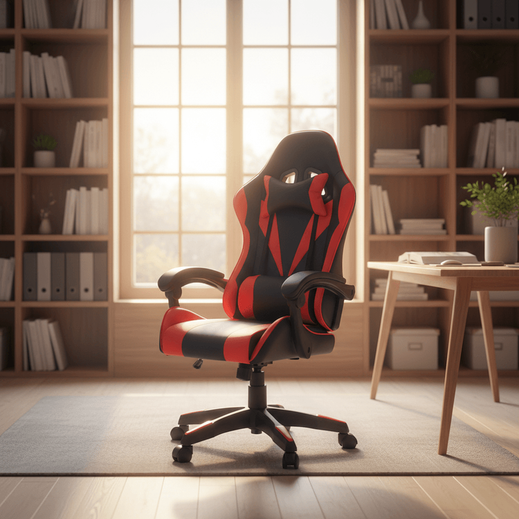
- Scene Display: Present the chair's usage effects in different scenarios (such as conference rooms and individual workstations) through real office environment photos or 3D renderings, stimulating user empathy.
- Materials and Craftsmanship: Use close-up images to showcase details of key components (such as gas lifts and five-star bases), labeling materials (such as steel frames and eco-friendly leather) and certification standards (such as BIFMA certification) to enhance trust.
Promotional Information
If used for promotional activities, add limited-time offers (such as "100 yuan off the first order"), contact information, or QR codes in the back cover or inner page corners to guide users to take further action.
III. Design Details
- Color Scheme: Limit the primary colors to no more than three to avoid visual clutter. Modern styles can opt for cool tones (such as blue-gray) to convey professionalism, while classical styles can use warm tones (such as brown-red) to create a cozy feel.
- Font Selection: Use bold sans-serif fonts (such as Source Han Sans) for titles and easily readable Song or Kai fonts for the main text, with clear hierarchy in font sizes.
- Whitespace Handling: Appropriately use whitespace to avoid crowding, highlighting key information (such as prices and features) through bolding or color changes.
By precisely controlling style, content, and details, office chair promotional brochures can effectively convey product value and attract target customer attention.