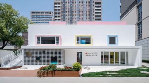
How Color Affects Perception in Office Spaces
As one of the elements of visual form, color reflects people's psychological state in the moment and the associations it sparks.
In office space design, color is both an emotional rendering and a form of communication, so the impact of an office's color scheme on people's psychology must be fully considered.

Nowadays, employees increasingly reject one-size-fits-all office environments in favor of spaces that offer mental and emotional stimulation. But everyone's emotional expectations of the workplace and understanding of office design differ: some women feel gloomy in gray, beige, or white offices, while some men have no interest in purple or orange workspaces. So when we consider an office's color scheme, we need a deep understanding of the emotions and information that colors convey.
Color psychology
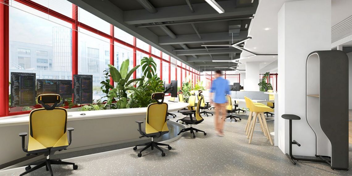
Color is only visible when it reflects light, so everyone experiences it differently. It has long been believed that color exerts a powerful influence on how we think and feel — some colors can even raise our blood pressure, speed up our metabolism, or accelerate eye fatigue. Our emotional response to a color is related to its saturation and brightness. Through color, we can influence mood, reshape the form of a space, and even change the perceived temperature of a room.

Although the industry has some standard color parameters, there's no definitive formula. We typically use warm palettes to activate and create high-energy color schemes, while cool palettes are used for feature areas and immersive color rooms. Soft, cooler tones help create a quiet space for concentration or rest. Still, we must keep pushing beyond convention, creating fresh, tailored color combinations that deliver experiences with real impact.
Color balance in office spaces
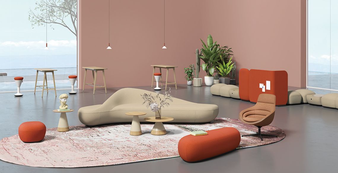
A recent University of Texas study found that monochrome environments evoke feelings of sadness and depression. By contrast, thoughtfully designed spaces whose combinations of materials and colors appeal to a broader audience trigger positive emotional responses. An office color scheme therefore can't be too uniform — a single color tends to feel oppressive. Yet too many colors cause aesthetic fatigue and scatter attention, so the number of colors should generally not exceed six. While controlling the count of colors, it's also important to weigh their independence from and relationship to one another. For example, if the space's overall palette is dominated by cool blues and grays, adding red or yellow in one or a few spots can enliven the atmosphere and add a sense of joy.

Influencing behavior
Color guides behavior and values in the workplace, so clients choose different palettes for different purposes. Carefully choosing the right color scheme and accent colors can encourage desired behaviors and establish culture.

When leading a project, designers need to be clear and candid about how color upholds the right decisions. Perceiving color requires reading it within its space and its ambient atmosphere. It performs differently at different times of day or year, depending on how light reflects and how it pairs with other materials. A meticulous exploration of color can deepen the relationship with the client and the understanding of the space.
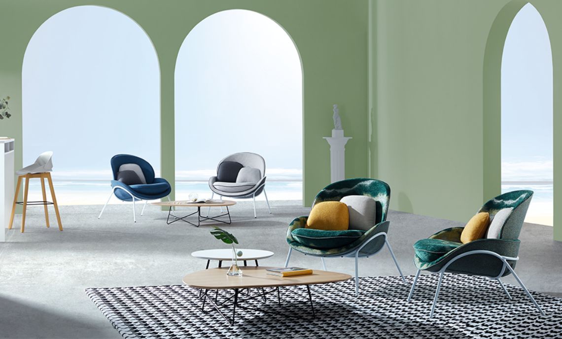
Technological progress has added complexity to the way people work, and offices have shifted from traditional enclosed spaces to open-plan ones, making today's workplaces more flexible than ever. In choosing color schemes, we should draw closely on the theories of color psychology, aesthetics, and design, connect them with practical realities, and create office spaces suited to both functional needs and emotional ones.
You may also like

Office Furniture Trends: Creating Dynamic Learning and Training Spaces
Read MoreChampioning Formaldehyde-Free Offices: Yihang's Healthy Work Mission Upgraded
Read More
European Designer Interview: Uncovering the Fun of Office Furniture
Read More